
Animating Plots With Python
Published:
The aim of this notebook is to explore graph animation techniques with python.
To do so, we are using some data from gapminder about CO$_2$ Emissions, population, and GDP per capita.
Data preparation
Gapminder data are often used in examples about how to animate graphs with python (check this tutorial by plotly or this other example).
I wanted to add a personal touch to the publication, so I added some extra features to the data to produce a different plot from the ones we can find in similar demonstrations.
Hence, some previous steps of data preparation are needed. You can find a detailed description of the data wrangling process in this notebook.
import pandas as pd

df = pd.read_csv("prepared.csv")
And this is the data we are using to try animating graphs with python.
df.info()
<class 'pandas.core.frame.DataFrame'>
RangeIndex: 40850 entries, 0 to 40849
Data columns (total 8 columns):
 #   Column           Non-Null Count  Dtype
---  ------           --------------  -----
 0   Unnamed: 0       40850 non-null  int64
 1   country          40850 non-null  object
 2   year             40850 non-null  int64
 3   co2_per_capita   40850 non-null  float64
 4   gdp_per_capita   40850 non-null  float64
 5   population       40850 non-null  int64
 6   iso_alpha3_code  35045 non-null  object
 7   continent        40850 non-null  object
dtypes: float64(2), int64(3), object(3)
memory usage: 2.5+ MB
Animating Graphs Using matplotlib
The strategy here with matplotlib consists of creating a plot for each year via iteration and then combine them in a GIF with the PIL library.
First of all, we must load the necessary packages. When using matplotlib in jupyter notebooks, I think it is great to use this little hack in the configuration —%config InlineBackedn.figure_format='retina'— to improve the quality of the outcoming plots.
import matplotlib.pyplot as plt
%config InlineBackend.figure_format ='retina'
I like tweaking some matplotlib parameters to get an eye-catching result and an adequate resolution for the plot.
plt.style.use('ggplot')

plt.rcParams["grid.alpha"] = 0.9
plt.rcParams["xtick.major.size"] = 0
plt.rcParams["xtick.minor.size"] = 0
plt.rcParams["ytick.major.size"] = 0
plt.rcParams["figure.figsize"] = (6.4*1.2, 4.8*1.2)
It is necessary to transform continent into categories to group the data by this attribute later.
df['continent']=pd.Categorical(df['continent'])
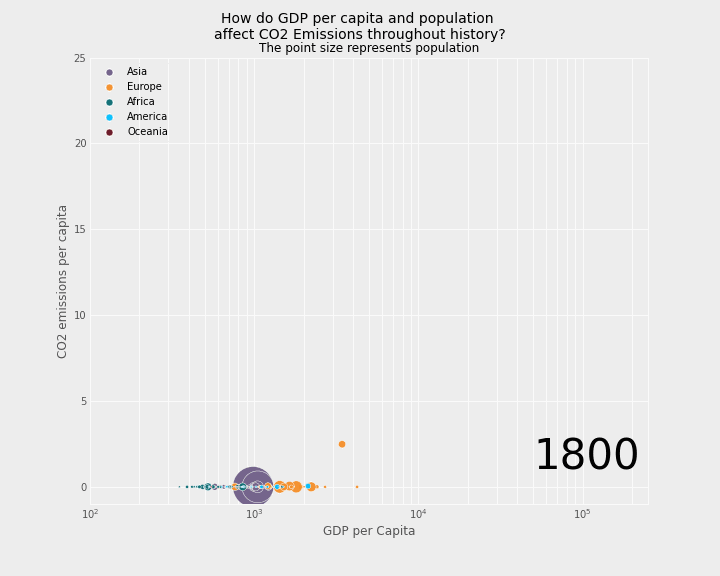
Something I had to do was to play with the axis limits. Here we can see that the Y-axis’s max value (247) is way higher than the one that I set up afterward (25). Data science is about making decisions. My choice here serves me to highlight the linear relationship that stands out throughout the time between the GDP per capita and the CO$_2$ Emissions. Otherwise, this relationship is harder to appreciate.
Furthermore, the number of countries above the CO$_2$ Emissions limit of 25 are few and happens occasionally. In a professional context, the best practice would be to investigate what is producing these high values. You might find significant patterns.
xmin = int(df['gdp_per_capita'].min())
xmax = int(df['gdp_per_capita'].max())

ymin = int(df['co2_per_capita'].min())
ymax = int(df['co2_per_capita'].max())

(xmin,xmax),(ymin,ymax)
((247, 177522), (0, 247))
A drawback that I found of using matplotlib is that it is complex to set fixed values for the markers’ size in the legend. I got it from this StackOverflow answer.
If you don’t want the markers sticking out of the legend, this step is mandatory.
So, we have to create a function to update a handle (see the first parameter in help(plt.axes.Axes.legend)) property in the plt.legend() function.
from matplotlib.legend_handler import HandlerPathCollection

marker_size = 48
def update_prop(handle, orig):
    handle.update_from(orig)
    handle.set_sizes([marker_size])
Then, you have to pass a dictionary to the handler_map parameter inside the plt.legend() function, as you can see in the code chunk below.
# Awesome palette generated with coolors.co
cdict = {
    "Asia": "#73628a",
    "Europe": "#f58f29",
    "Africa": "#096b72",
    "America": "#00bfff",
    "Oceania": "#66101f"
}


# For each year:
for i in df.year.unique():

    # initialize a figure
    fig, ax = plt.subplots(1, 1, figsize=(10,8))
    fig.subplots_adjust(top=0.875)

    # Add titles (main and on axis)
    plt.xscale('log')
    plt.xlabel("GDP per Capita")
    plt.ylabel("CO2 emissions per capita")
    plt.suptitle("How do GDP per capita and population \naffect CO2 Emissions throughout history?\n", size = 14)
    plt.title("Dot size represents population", size = 12)
    plt.xlim(100,2.5E+5)
    plt.ylim(-1, 25)

    # Plot year
    plt.text(5.0E+4, 1, s=str(i), fontdict={"fontsize":42})

    # Plot according to the year and contninent
    for continent in df.continent.unique():
        year_and_continent = ((df.year == i) & (df.continent == continent))
        x = df.gdp_per_capita[year_and_continent]
        y = df.co2_per_capita[year_and_continent]
        t = df.iso_alpha3_code[year_and_continent]
        s = df.population[year_and_continent] / 2e+5

        sc = plt.scatter(x, y, s=s, c=cdict[continent], edgecolors="w", label=continent, alpha=0.95)

    # TODO: add country names

    ax.grid(b=True, which='major', color='#ffffff', linestyle='-')
    ax.grid(b=True, which='minor', color='#ffffff', linestyle='-')

    plt.legend(
        loc="upper left",
        handler_map={
            type(sc): HandlerPathCollection(update_func=update_prop)
        }
    )

    # Save it
    filename='images/step_'+str(i)+'.png'
    plt.savefig(filename, facecolor=fig.get_facecolor(), transparent=True)
    plt.close("all") # to avoid displaying all plots
It’s crucial to add the named parameters in plt.figsave. Otherwise, this function will override these parameters to the default.
The result set of .png is saved and then transformed from png to GIF. For this, I used the PIL package and glob to read the files.
from PIL import Image
import glob

# Create the frames
frames = []
images = sorted(glob.glob("images/step_*.png",))

for i in images:
    new_frame = Image.open(i)
    frames.append(new_frame)

# Save into a GIF file that loops forever
frames[0].save('png_to_gif.gif', format='GIF',
               append_images=frames[1:], duration = 500,
               save_all=True, loop=0)
Pros of matplotlib
- Full customizable data representation.
Cons of matplotlib
- Requires a considerable amount of code.
- There are some dependencies.
- Not interactive.
The result
Finally, we can display the created gif with markdown language as in the snippet below:

Animating Graphs Using plotly.express
Animating a graph with the plotly library may be reasonably straightforward. They have this high-level API called plotly.express that allows you to create a chart with a few code lines. Check the docs for more details.
With the following lines, I get a similar output to the previous one, with the addition that this one is interactive! If you hover over the data points, you’ll get additional information. This kind of interactivity is beneficial for particular audiences.
import plotly.express as px

fig = px.scatter(df, x="gdp_per_capita", y="co2_per_capita", animation_frame="year",
                 animation_group="country", color="continent", hover_name="country",
                 log_x=True, range_y=[-1,25], range_x=[100,200e3], size="population", size_max=50,
                 title = "How do GDP per capita and population affect CO2 Emissions throughout history?")

fig.update_layout({
    "plot_bgcolor": "#f0f0f0",
    "paper_bgcolor": "#f0f0f0"
})

fig.update_xaxes(title_text='GDP per Capita')
fig.update_yaxes(title_text='CO2 emissions per capita')
plt.close("all")
When writing a post like this one, you’ll need to save the result to display it. I found that this was not an easy task. After searching through several sources, I found this great post by Matteo Guzzo, which helped me a lot to complete this part.
To sum up, after creating the plot, we must save it into a .html file to then display it. The file must include a link to the plotly.js library. That’s why it is mandatory to use this include_plotlyjs='cdn' parameter when saving the plot. See Matteo’s blog post for more detail on how this works.
with open('plotly_graph.html', 'w') as f:
    f.write(fig.to_html(include_plotlyjs='cdn'))
Pros of plotly
- Reach a beautiful data representation with relatively little code
- Allows interactive plots
Cons of plotly
- There’s no easy way to put the result in a blog post.
- Plot owned by
plotly. plotly.express, as a high-level API forplotly, has some functionality limitations (e.g., inserting subtitle or text annotations). Aplotlyapproach would allow it but would be more code-intensive than the ones shown in this post.
The result
Here is the result. I had to copy the <div> tag and its content from the generated .html file in this post to produce it.c